The WordPress Accordion Block allows you to organize and display content in a collapsible format. This block is particularly useful for presenting information in a compact and user-friendly manner, where users can click on a section to expand and view the details.
By default, the Accordion Block shows only the headings. As a result, users don’t get overwhelmed by too much information at once. You can use the Accordion Block in various sections of your WordPress website for FAQs, product features, service descriptions, or any other key information.
The default Gutenberg block editor doesn’t have the Accordion block. This is why you have to depend on a plugin. In this post, I will show you how to use the WordPress Accordion Block using two popular plugins. You can select any plugin as per your choice in the end.
Method One: Create Collapsible Content Using Ultimate Blocks
Ultimate Blocks is a promising Gutenberg block plugin. It includes 25+ custom blocks that can help boost your content marketing efforts and outcomes.
Step 01: Install and Activate the Ultimate Blocks Plugin
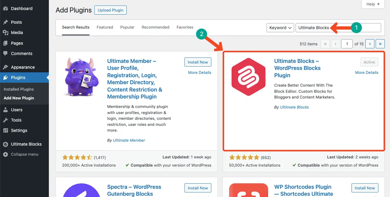
Ultimate Blocks has a free and premium version available. Go to Plugins > Add new plugin. Install and activate the free version of the plugin.
Step 02: Add the Accordion Block of the Plugin to the Editor
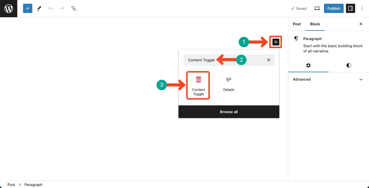
Open a post/page. Click the plus (+) icon on the editor. Type Content Toggle. The block will appear in a second. Add the block to the editor.
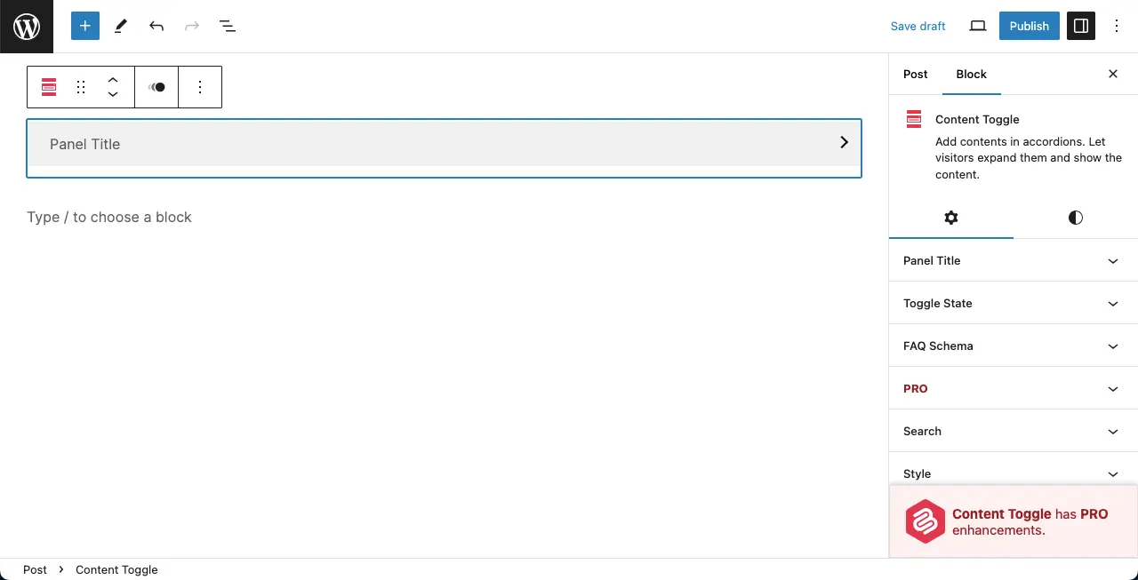
You can see the block is added to the editor with an accordion layout. By default, you’ll see only one panel in the accordion.
Step 03: Add More Rows to the Accordion
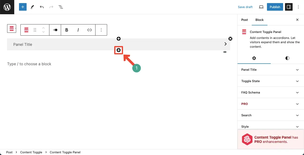
Hovering your cursor on the accordion will show up a plus (+) icon on the top and bottom edge of the row. By clicking this plus (+) icon, you can add more panels to the section.
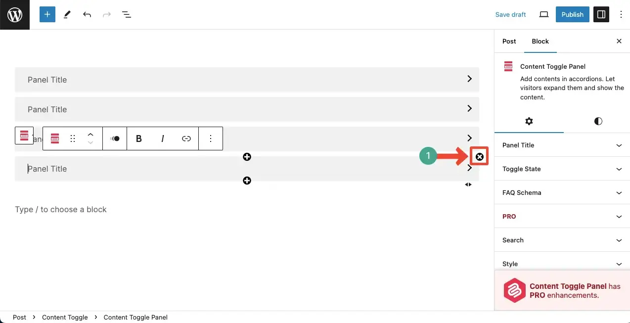
To remove a panel, hover your cursor again and click the cross (x) icon on the top-right edge.
Step 04: Add Content to the Content Toggle Block
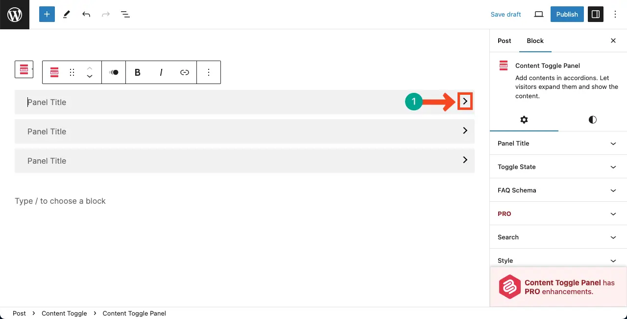
Click the arrow icon on a panel to expand it.
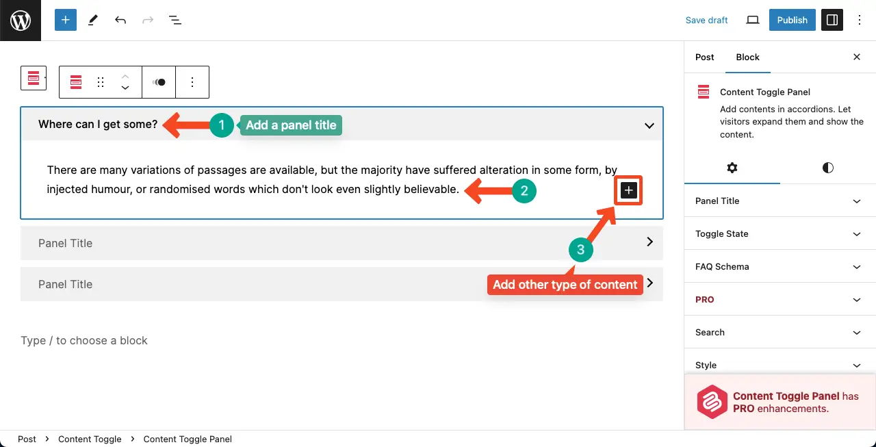
Once the panel is extended, write a title on the panel head, and then a description.
To add images and videos, please click the plus (+) icon on the panel description area. Select the respective blocks and then add content. Thus, you can add different types of content to the accordion section with Ultimate Blocks.
Step 05: Configure Settings of the Block
Go to the Settings tab on the right sidebar.
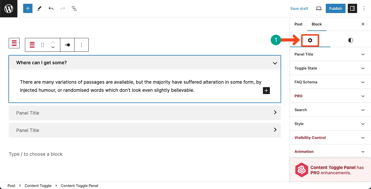
You can do the following things with the options under the tab.
- Panel Title – Set heading (h2-h6) for the panel title.
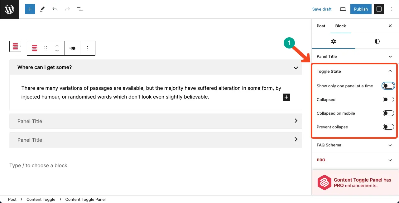
- Toggle State – You may show only one panel at a time, or show each panel collapsed, or prevent them from being collapsed. Our recommendation is you toggle on Show only one panel at a time.
- FAQ Schema – Enable the FAQ schema.
- Search – You can add a search box. If the content section is so long, the search box will help users find the specific content very quickly.
- Style – Allows adding highlighting color to special texts.
- Visibility Control – Set specific roles who can see the content toggle block.
- Animation – Choose from multiple animation options for the block.
- Responsive Control – Hide the block on any device type (Desktop, tab, and mobile)
Step 06: Stylize the Content Toggle Block
Next, come to the Styles tab.
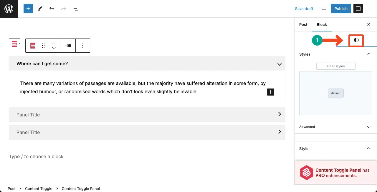
You can do the following things here.
- Colo Schema – Add separate color for the container, title, title link, and toggle.
- Border – Showcase a border around each panel.
- Toggle Status Icon – Change the toggle icon position and its color.
Thus, you can use the Content Toggle block of the Ultimate Blocks plugin.
Note: WordPress has a default details block, which is kinda similar to the accordion block. But the default block lacks many advanced features. Still, you can take a look at the WordPress Details block.
Method Two: Create Collapsible Content Using CoBlocks
CoBlocks is developed and maintained by the popular hosting company GoDaddy. The plugin is free to use. It has 30+ free custom blocks for the Gutenberg Editor.
Step 01: Install the CoBlocks Plugin
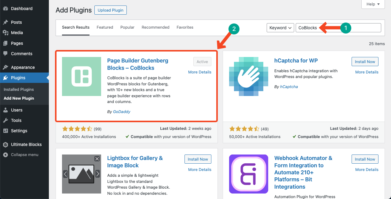
Go to Plugins > Add New Plugin. Then, find the CoBlocks plugin by typing its name in the top-right cornered search box. Once the plugin appears, install and activate it.
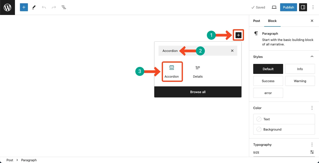
Step 02: Add the Accordion Block to the Editor
Like the above method, find the Accordion block and add it to the editor.
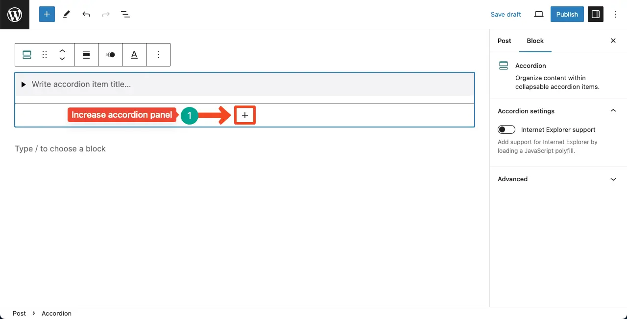
Step 02: Increase the Accordion Panel Number
By clicking the plus (+) icon below the first panel, you can increase as many panels as you want.
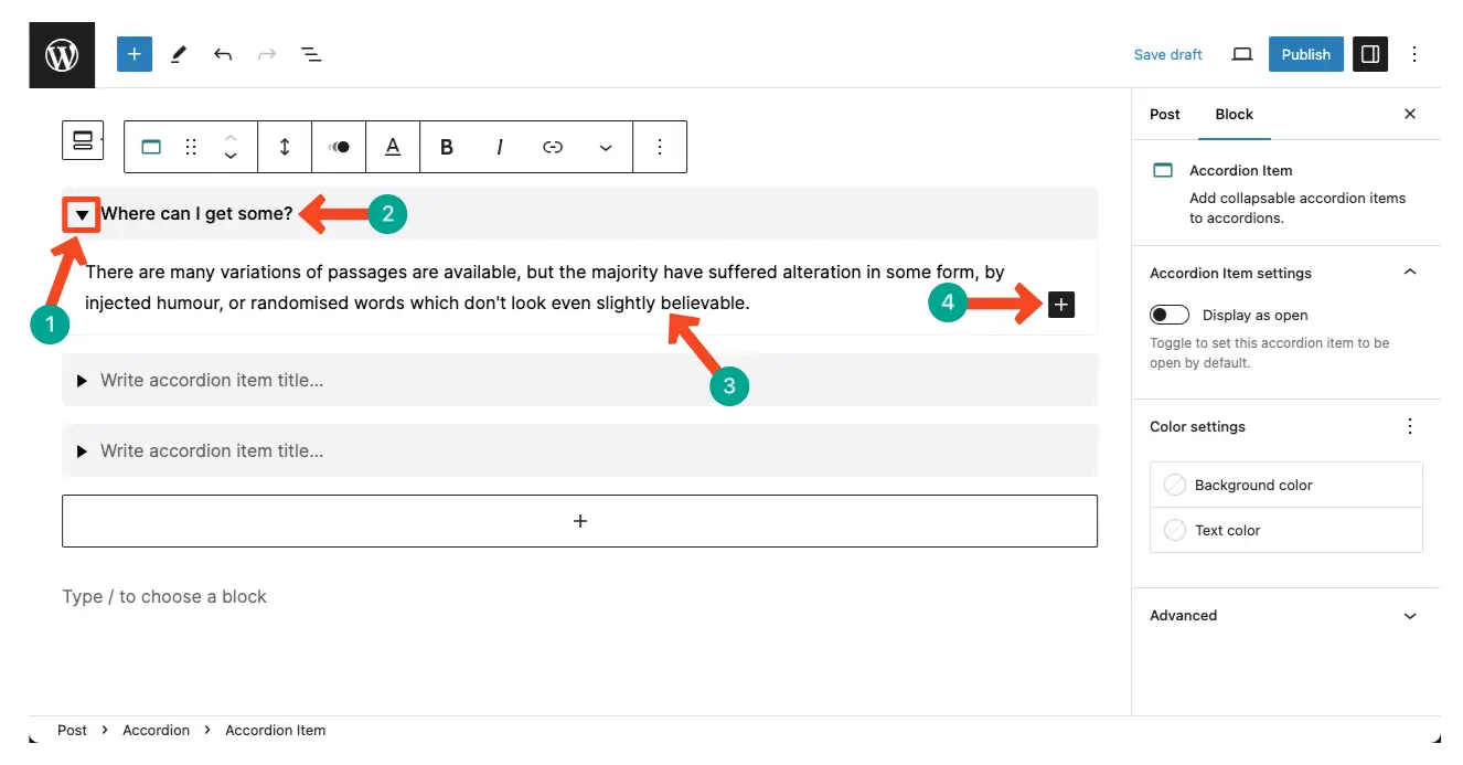
Step 03: Add Content to the Accordion Panel
Click the arrow icon to expand the panel. Write a title on the panel head. Then, write a detailed copy in the description section.
To add other types of content like images, videos, gifs, and else, hit the Gutenberg plus (+) icon.
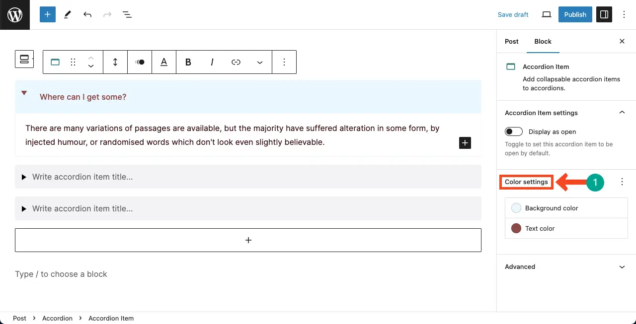
Step 04: Customize the Accordion Block of CoBlocks
You can customize the panel title and description sections separately. Keep your cursor on the panel title area. You’ll get the color settings option on the right sidebar. You can customize the background and text color of the panel title section.
Next, place your cursor on the description section. You can customize the description section’s style, text color, and typography.
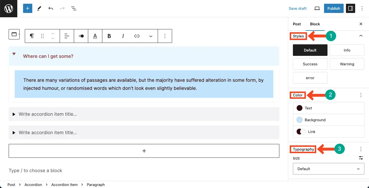
Do, the changes accordingly. Thus, you can use the Accordion block of the CoBlocks plugin.
Final Notes!
The WordPress Accordion Block is a powerful tool for creating collapsible content on your website. But before using the block, it’s important to plan your content structure in advance, organizing it into logical sections that can be collapsed and expanded. This allows users to navigate through the information effortlessly.
Next, keep your accordion content concise and focused. Avoid overwhelming users with lengthy paragraphs or excessive details. Instead, use clear headings and brief descriptions to provide a glimpse of the content within each accordion section.
