The Gutenberg Navigation block allows you to create and customize a set of menus that effortlessly guide visitors to the website. From simple dropdown menus to sophisticated mega menus, the block gives you the freedom to design a navigation system that aligns perfectly with your website.
As block-based web design is getting increasingly popular, the usage of this block is gradually increasing. I will show you how to use the Gutenberg Navigation block in this tutorial post.
What is the Gutenberg Navigation Block?
The Gutenberg Navigation block is a default block of the WordPress block editor. It allows you to create and customize navigation menus for your website without depending on any plugin or complex coding. You can effortlessly create simple or mega menus, whether with dropdowns or not.
The block offers a wide range of customization options, enabling you to tailor the navigation to your unique web design and structure. Visitors can easily navigate the site and find the content they are looking for, leading to increased engagement and satisfaction.
How to Use the Gutenberg Navigation Block in WordPress
To use the Navigation block, you first have to create several pages on your backend. Otherwise, the block won’t work perfectly because it can’t source the relevant content.
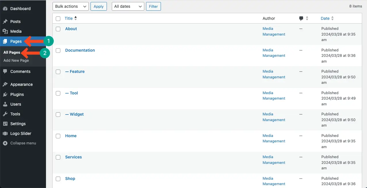
Step 01: Create Several Pages and Child Pages
Go to WordPress dashboard > Pages. Create several pages and child pages. Publish them.
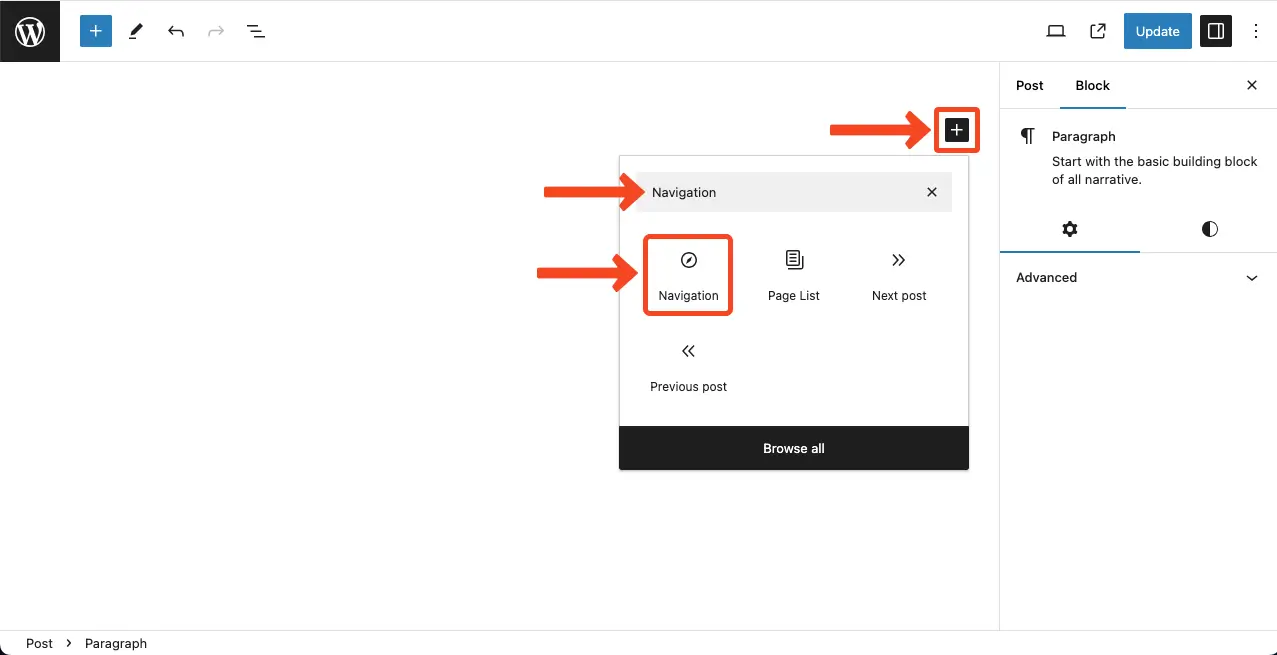
Step 02: Add the Gutenberg Navigation Block to Your WordPress Editor
Open the WordPress editor with a post or page. Press the plus (+) button. Type the block name ‘Navigation’ in the block library and add it to the editor once you see it.
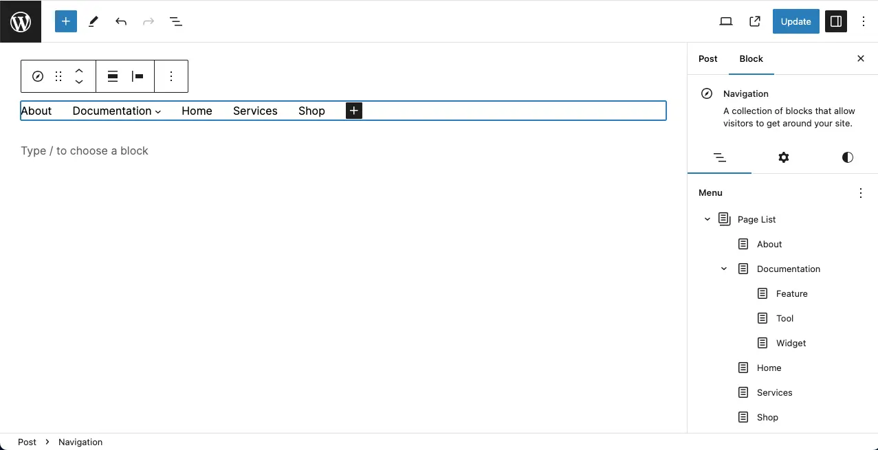
As soon as the block is added to the editor, you will see the page names horizontally in menu form.
You can see the page names on the right sidebar including the child page names. Once you add a new page or child page, it will automatically appear in this menu.
Step 03: Add New Items to the Navigation Menu
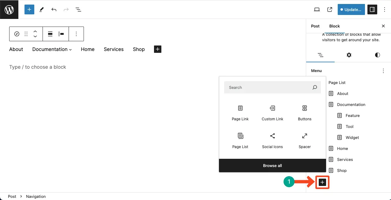
You’ll get the plus (+) button both at the end of the navigation menu on the editor and on the right sidebar under the list view tab. You can add new items to the menu by clicking any button.
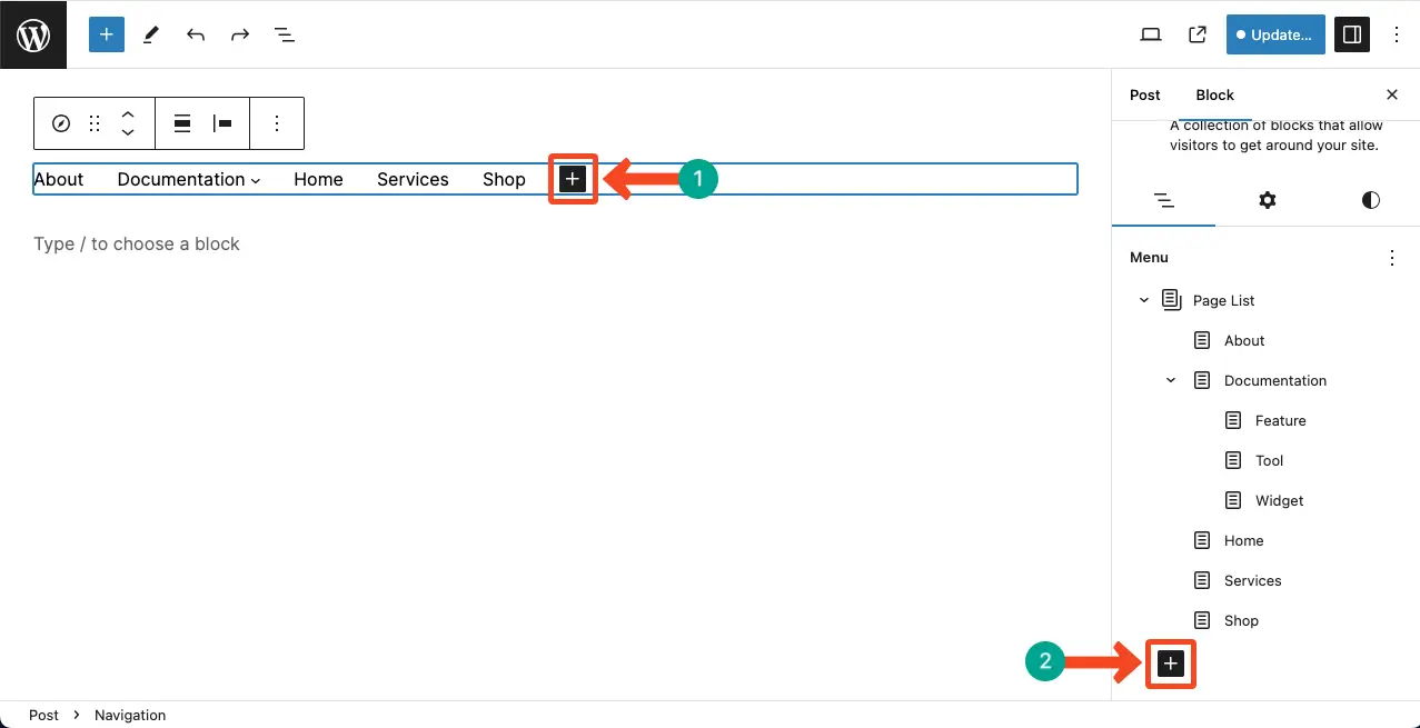
Click any plus (+) button of the two. You’ll see the Gutenberg block library has opened. Find the item you want to add in the menu section.
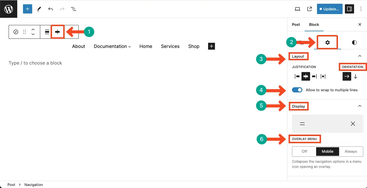
Step 04: Customize the Appearance of the Navigation Menu
You can customize the alignment of the menu from the Justification option. I have aligned it centrally. After that, you can change the orientation whether horizontally or vertically.
By enabling the Allow to wrap to multiple lines option, you can showcase the menu items in multiple lines if they are too many.
Finally, the entire navigation menu won’t be entirely displayed on mobile devices. It usually comes with a hamburger icon. From the Display option, you can choose the hamburger icon for the mobile device.
Do the configuration as you want.
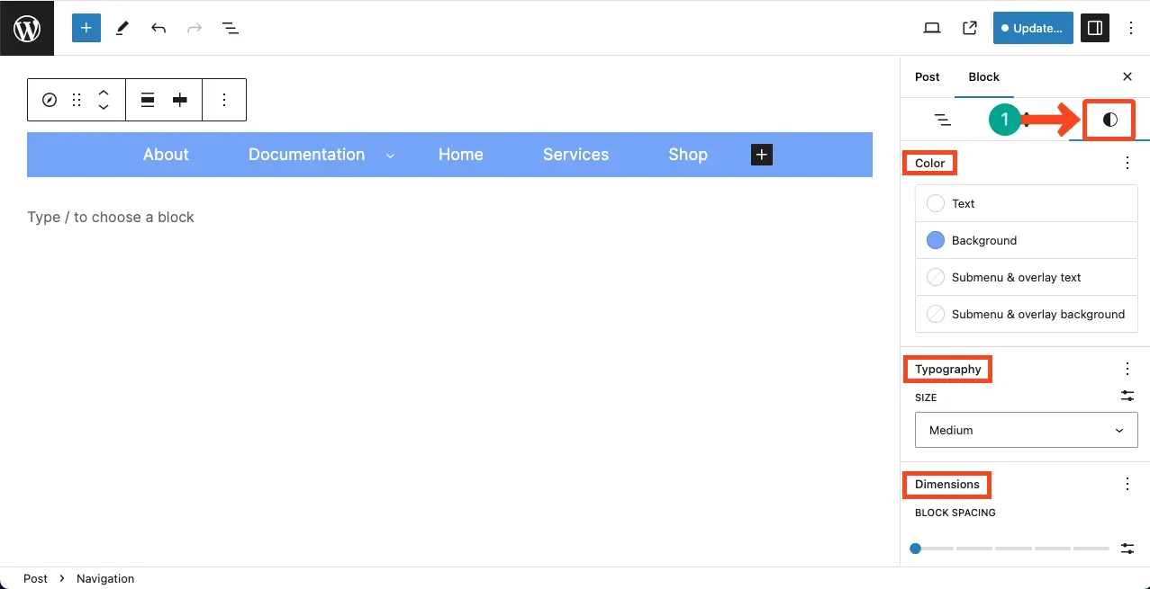
Step 05: Stylize the Gutenberg navigation block
From the Stylize tab, you can change the text color, background color, typography, dimension, etc. Hope you can do it alone.
Learn how to use the WordPress Tag Cloud block.
Best Practices of the Gutenberg Navigation Block
By following the best practices covered below, you can maximize the effectiveness of the Gutenberg Navigation Block. You create a seamless and user-friendly navigation experience for your website visitors.
1. Plan Your Menu Structure
Before designing your navigation menu with the Gutenberg Navigation Block, take some time to plan and organize your menu structure. Consider the hierarchy of your pages, categories, and subcategories. A well-structured menu will make it easier for visitors to navigate your site.
2. Keep It Simple and Concise
While the Gutenberg Navigation Block offers a range of customization options, it’s important to keep your menu simple and concise. Avoid overwhelming visitors with too many menu items or submenus so they don’t get distracted.
3. Use Clear and Descriptive Labels
Ensure that the labels for your menu items are clear, descriptive, and easy to understand. Use relevant keywords that accurately represent the content visitors will find when they click on each menu item. This will help users quickly identify the information they are seeking.
4. Consider Mobile Responsiveness
With the increasing use of mobile devices, it is crucial to ensure that your navigation menu is mobile-responsive. Test your menu on different screen sizes and devices to ensure it displays properly and remains accessible and user-friendly on mobile devices.
5. Preview and Test Your Menu
Before publishing your website, take the time to preview and test your navigation menu. Ensure that all links are working correctly and that the menu displays as intended. Test the menu on different web browsers to ensure compatibility across platforms.
Conclusion
With simple dropdowns to mega menus, the possibilities are endless with the Gutenberg Navigation block. In this post, I have covered a basic tutorial on how to use the Gutenberg Navigation block. In my coming posts, I will cover more in-depth articles on how to use the block on different types of websites.
Stay with me to learn about the Gutenberg block editor. If you have any suggestions, you can let me know whether through the common box below or the modal popup on the right sidebar.